Kris, what a delight it is to catch up on your site! It is like receiving a gorgeous book of the most extraordinary atcs and cards! I can't believe it is free for the viewing!
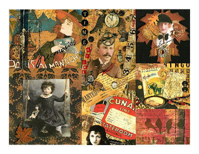
Marie certainly didn't subscribe to the theory that "Less is more," and neither do I. So it's only natural that I love the rich details and the vibrant colors of your arch. The colors you chose are a bold and welcome surprise, since they are not the typical pastel pinks and blues so often used in works on this theme and somehow very fitting her personality. I also love the sharpness of the contrast in the polka dots and text. And then.... there's that HAT! Bravissimo, Kris.
 http://gothicarches.ning.com/ to see all the ~Marie~ creations this week!
great arch!! so much to see, love all about it!!
ReplyDeleteBeautiful Marie arch Kris!
ReplyDeletewow beautiful collage I love her hat
ReplyDeleteOh, great!!! I love marie's hat!!! :O)
ReplyDeleteThis arch is really beautiful, Kris! ~Lori
ReplyDeleteGreat arch, Kris. I love her head gear!
ReplyDeleteWonderful collage and design, Kris!
ReplyDeleteYour collage is so awesome, Kris! Beautiful! LynnF
ReplyDeleteGreat hat!! ;)
ReplyDeleteSo gorgeous, Kris.
ReplyDeleteWhat a fabulous collage, Kris, the colours & detail & design all superb!
ReplyDeletethis is wonderful Kris! gorgeous collage work! :)
ReplyDeleteThis is absolutely beautiful.
ReplyDeleteGorgeous arch.
Exquisite!!! I love all the details! This arch is beautiful and so well put together! Thank you for participating!
ReplyDeleteKristin
Beautiful arch! The colours are just perfect and all the details make it a masterpiece.
ReplyDeleteKris, what a delight it is to catch up on your site! It is like receiving a gorgeous book of the most extraordinary atcs and cards! I can't believe it is free for the viewing!
ReplyDeletewhat a wonderfull Arch, I love your collage, it's fantastic
ReplyDeleteKris, I love this arch you did!
ReplyDeleteA great arch
ReplyDeleteMarie certainly didn't subscribe to the theory that "Less is more," and neither do I. So it's only natural that I love the rich details and the vibrant colors of your arch. The colors you chose are a bold and welcome surprise, since they are not the typical pastel pinks and blues so often used in works on this theme and somehow very fitting her personality. I also love the sharpness of the contrast in the polka dots and text. And then.... there's that HAT! Bravissimo, Kris.
ReplyDelete