 My least favorite color is Lemon Yellow...and not just any Lemon Yellow but SU!'s YoYo Yellow so I chose to include it in my Zetti creation. You can join this fun challenge at: http://mixedmediamonday.wordpress.com/
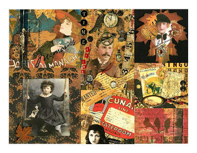 My least favorite color is Lemon Yellow...and not just any Lemon Yellow but SU!'s YoYo Yellow so I chose to include it in my Zetti creation. You can join this fun challenge at: http://mixedmediamonday.wordpress.com/
Hi Kris, it's wonderful. It's amazing what we can do with something when we challenge ourselves. Diane
ReplyDeleteWonderful card, love all the brillant colours.
ReplyDeletegreat card! you did wonders with yellow!
ReplyDeleteI have to admit that I am not fond of Lemon Yellow but you have surrounded it with luscious colours and wonderful Zetti type bits and pieces and it all comes together to make a thoroughly scrumptious picture.
ReplyDeleteNot a favorite of mine either, but you made it look delicious here. The Zetti style and all the rich details are fabulous, especially the parrot!
ReplyDeleteYou hid your lemon yellow in the middle of a luscious feast of vivid colors. Well done, Kris!
ReplyDeletethis is so much fun!!! great details and I love these colours....
ReplyDeleteI had to laugh ,thats my least favorite color too!!!! But you made it work for you just fine!
ReplyDeleteYah, that would be a hard color to work with..beyond bright! But you did well with it..
ReplyDeleteWow fantastic collage Kris.
ReplyDeleteAmazing details. Love them.
wowser!!!! A color explosion which is my thing!!!!
ReplyDeleteyou made the best out of it!!
ReplyDeletelove this wonderful vibrant zetti style piece!
Absolutely awesome
ReplyDeleteWhat a brilliant vibrant work, Kris. Fantastic colours and design!
ReplyDeleteOMG--is that bright or what?! Can you believe that when I was in junior high and high school, my bedroom was painted a bright lemon yellow like that? Of course, the walls were filled with posters but STILL. I'm with you--the color is challenging. LOL!
ReplyDeleteKris, I love your Zetti piece. I guess I'm too old to be able to envision Zetti, but I think it's a fun genre to look at. The lemon yellow adds that light splash to balance all the deeper colors. It's beautiful.
ReplyDeleteGreat collage Kris! I like that yellow color, though. It looks nice in this.
ReplyDeleteWell, it's cool collage Kris and you made me realise that I hardly ever use yellow. Strange! And yet I have convinced myself I dislike reddy-pinks and orange! Love your zetti-vixen! =)
ReplyDeleteThis is wonderful! You would never know that it is your least favorite color - fabulous piece! Kristin :)
ReplyDeleteKris...the colours are great...that yellow makes them all pop! Love the card.
ReplyDeleteI just love your Lemon Yellow in your collage :) It fits just perfect with those other colors, lovely!
ReplyDelete